Stamp Research

Image


I really like the colours in this stamp. They catch the eye, and the blackness of the head highlights the jigsaw pieces. The message is really clear, and I think it highlights the importance of using block colours in the postage stamp. Because of the stamp being on such a small scale it really does need to catch thhe eye.


Image


 I think the composition in this stamp draws the viewer in, as it is a swirly vortex image. It makes the viewer concentrate on the message of the stamp.



ImageI liked these stamps as they combine various different ideas in an interesting way. I also like the connection it makes to my brief. 


Image


I found this stamp really successful as the it portrays an immediate message and also invites the viewer to look twice and read the message. 

Ideas… “Saving Energy in the Home”

After noting the various different methods used in the anti-smoking advertisements, I decided to focus on my brief. My brief is (basically) is to design a stamp that will encourage people to make positive changes to their lives to aid the environment. I’ve narrowed down the area I’m focusing on to “Saving Energy in the Home”. I’ve chosen this area because I think that it is important for people to realise that they can make small changes themselves that will greatly impact the environment.

I thought in detail about what kind of changes I would like to promote… The ones I first came up with were the already well-publicised ones such as:

-turn off lights/ use energy saving bulbs

-turn off the tap

-recycle

So with that in mind, I decided to broaden the possibilities a bit more. I have a few ideas in mind:

-Low- Flow shower heads

-Insulating your home

-Line drying instead of tumble drying

-plant a tree

I want to explore these ideas more after researching various different stamp innovations.

I compiled a “Prezi” presentation for college on this also, which can be found at: http://prezi.com/3l6up2sfrqj1/saving-energy-at-home/

Anti-Smoking Campaign

The Anti-Smoking campaign also targeted people’s vanity, and their unwillingness to sepnd money. It showed the damage smoking does to ones’ appearance; and it reiterated the money that people were throwing away on cigarettes.

There were also many on the dangers that smoking does to your health, and how it kills you eventually. These are obvious solutions but there were still creative ideas linked to them, such as the use of the gun.

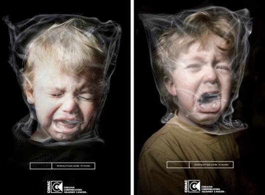
However, these advertisements are all negative. For my project I have to find a way of selling something to the public positively, which the anti-smoking campaign didn’t really do… The most positive image I found to deter people from smoking was the play on the “Nike” tic. And even this isn’t that positive. I can foresee how difficult it may be to portray a message for my brief using only positive imagery. It seems to me that the more horrifying the image; (such as the suffocating child) the stronger the message.

Eco Stamps

Before I look at stamps, I decided to look at eye-catching advertisements, and why they caught my eye. I focused in on a campaign that everyone knows, and everyone can visualize at least one ad from this campaign straight away. Which is why I found it effective. This is the Anti- Smoking campaign. This campaign used a variety of different tactics to catch the eye of the observer, and to get a powerful message across. It targeted children as the victims, and with powerful imagery portrayed the harmfulness of smoking through them.

Image